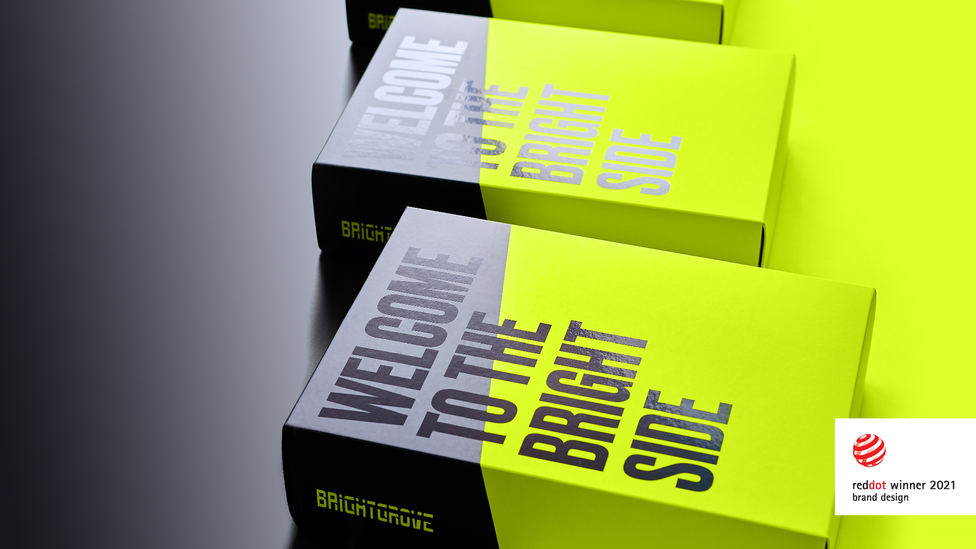
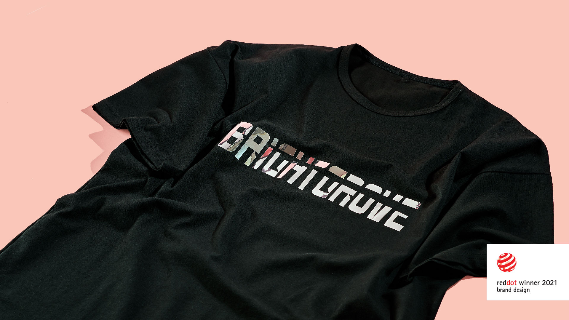
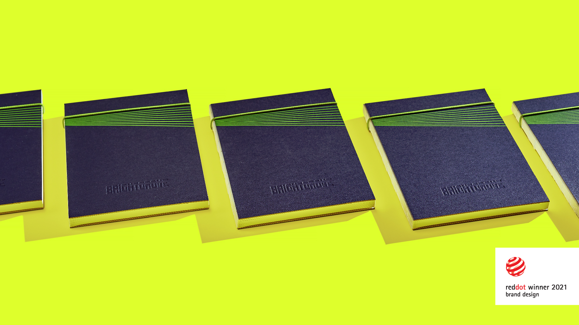
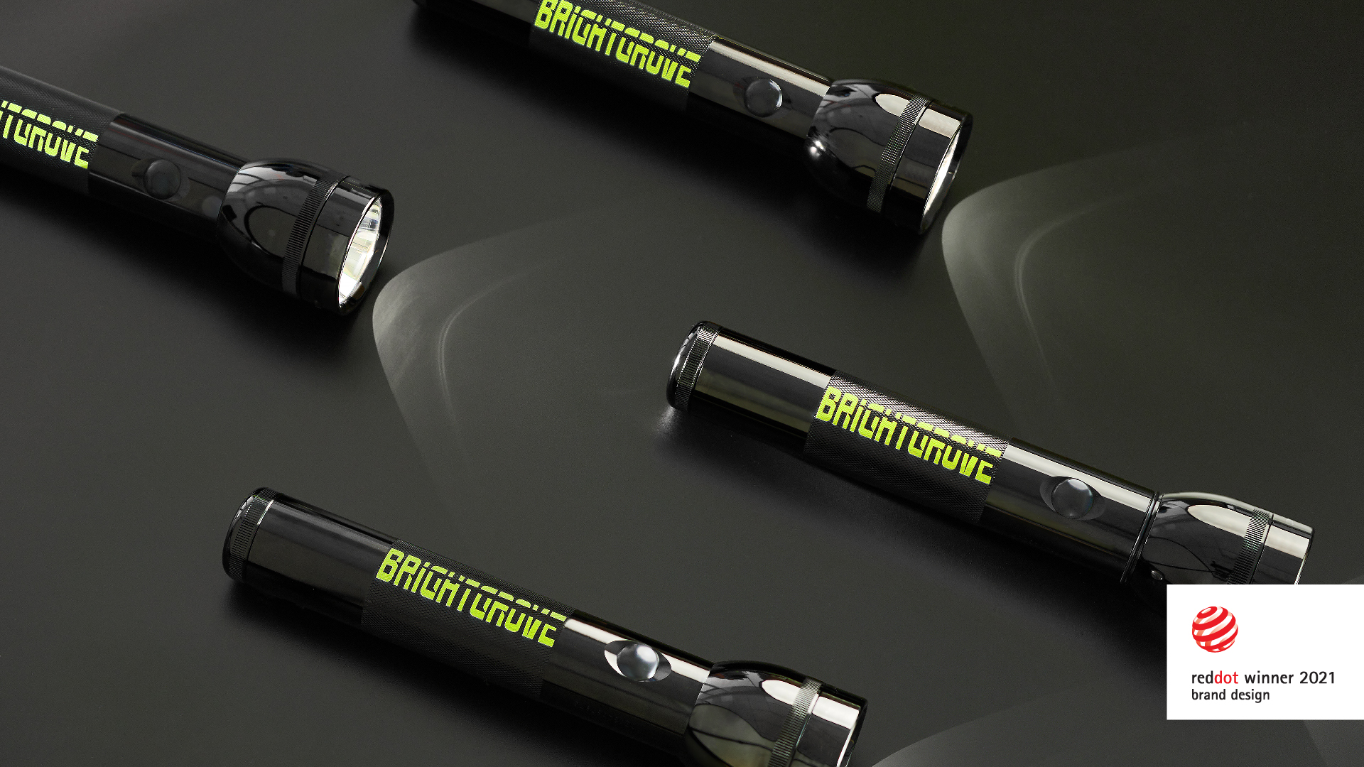
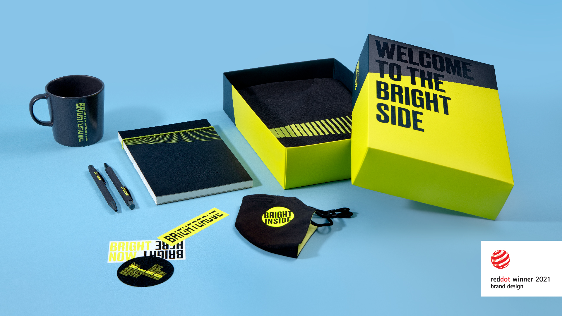
The branding is built around the name of the company, Brightgrove, and reflects their internal culture—bright, dynamic, constantly growing, changing, and searching. The new identity replaced the old one, which had been used for 10 years, lost its relevance, and hadn’t been reflecting the company’s values anymore.
Brightgrove logo and visual style won the Red Dot Award
Brightgrove won the Red Dot Design Award in the Brand & Communication Design category for the new logo and brand identity
Oleksii Hubskyi, Head of Marketing
August 11, 2021
The brand identity was designed by Art Director Sasha Yagnyuk along with the marketing team.
The key element of the brand identity is a ray of light. It is a metaphor for the main competitive advantage of Brightgrove—our ability to find rare talents, out-of-the-box decisions, and honest answers. The chosen brand color is yellow, bright because of the company’s name.
The logo font, created especially for Brightgrove, becomes a background for the ray thanks to its density. But the ray can also be used as a standalone asset or a container for content. It can highlight important elements, depending on the context and the media: for example, an event speaker in an image and the direction of the moving objects in a video.
